Beyond Basic: Creative Ideas for Custom Sign Board Design That Stand Out
In the relentless visual noise of the modern marketplace, a business’s sign is its silent ambassador. It’s often the first handshake, the initial point of contact that can either draw a customer in or allow them to pass by without a second glance.
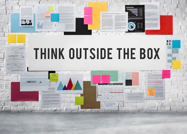
Yet, too many businesses settle for the mundane: a standard rectangular box with block letters. This approach isn’t just a missed opportunity; it’s a surrender in the battle for attention.
To truly captivate and convert, brands must view their signage not as a mere identifier but as a powerful piece of environmental storytelling. It's about moving beyond basic utility and embracing design that is deliberate, innovative, and deeply connected to the brand’s core identity.
A standout sign doesn't just announce your presence; it broadcasts your personality, values, and vision before a single word is spoken with a customer. The following ideas explore how to break free from the conventional and create a sign that is not just seen, but remembered.
Highlight: Materiality and Tactile Storytelling
Embrace Biophilic Design
Go beyond static materials and incorporate living elements. A sign featuring a backing of preserved moss, integrated planters with hardy succulents, or climbing ivy woven through cutout letters creates a powerful connection to nature.
This is perfect for wellness brands, organic cafes, or any business wanting to project an image of freshness, growth, and environmental responsibility.
Utilize Reclaimed and Historic Materials
Tell a story of authenticity and character by using materials with a past. A sign crafted from the reclaimed wood of an old local barn, aged corrugated metal, or repurposed industrial steel lends an immediate sense of history and permanence.
This approach resonates strongly with artisanal brands, heritage businesses, and establishments that pride themselves on craftsmanship and a connection to their community.
Create Depth with Layering
Flat signs are forgettable. Build visual interest by layering different materials. Imagine matte black acrylic letters mounted on a warm, polished wood panel, or brushed brass lettering set an inch off a raw concrete wall. This creates natural shadows and a 3D effect that changes with the light throughout the day, giving the sign a dynamic, high-end feel.
Highlight: The Art of Illumination
Master the Halo Effect with Reverse Channel Letters
Instead of illuminating the face of the letters, light them from behind. This technique, known as reverse or halo-lit channel lettering, casts a soft, elegant glow onto the mounting surface.
It feels more sophisticated and less aggressive than traditional front-lit signs. The resulting halo effect makes the lettering appear to float, creating a premium and almost ethereal aesthetic that is perfect for boutique hotels, fine dining, and luxury retail.
Integrate Programmable LED Animation
Static signs are a thing of the past. Use programmable LEDs to introduce subtle, tasteful animation. This doesn't mean a flashy, Vegas-style marquee. Consider a bar whose sign slowly "fills" with a warm, amber light as evening approaches, or a tech company whose logo features a single, slow-pulsing pixel.
This gentle dynamism captures the eye and communicates that the brand is modern, adaptive, and forward-thinking.
Go Guerrilla with Gobo Projections
For a truly unconventional and high-impact approach, ditch the physical sign entirely. A gobo (short for "goes before optics") is a stencil placed inside a projector to cast a specific image, like your logo or a promotional message, onto a surface.
Project your brand onto the sidewalk in front of your entrance or onto an adjacent blank wall at night. It’s unexpected, modern, and incredibly effective for generating buzz and creating an immersive brand atmosphere.
Highlight: Unconventional Form and Interactive Elements
Make the Sign Part of the Architecture
The most powerful signs are those that feel completely integrated with the building itself. Think beyond just hanging something on the wall. Could your logo be cut directly into a metal awning? Could the lettering wrap around the corner of the building? Can the door handle be a stylized version of one of the letters in your brand name?
This holistic approach treats the entire storefront as a canvas, demonstrating meticulous attention to detail.
Introduce Kinetic and Interactive Features
Engage the senses by creating a sign that responds to its environment or invites touch. This could be a sign with elements that spin or flutter in the wind, or one made from a uniquely textured material that people can’t resist touching.
This playful interactivity creates a personal connection and a lasting memory, making your brand feel more human and approachable.
Embrace Typographic Art
Treat the business name itself as the primary design element. Commission a truly custom font, exaggerate the scale of the letters, or deconstruct the name into an abstract-yet-legible piece of art.
When your typography is the hero, it communicates a strong, confident brand identity that values artistry and design.
Leverage the Power of Negative Space
Often, what you don’t include is as important as what you do. A minimalist sign—a simple logo subtly laser-cut from a Corten steel plate, or tiny brass letters on a vast, clean wall—can be incredibly powerful.
It subverts expectations and communicates confidence, elegance, and a focus on what truly matters. It makes people look closer, drawing them in with a whisper rather than a shout.
Conclusion
Ultimately, a truly effective sign is a bold declaration of your brand’s place in the world. It’s a public piece of art that should be invested in with the same care and creativity as your products or services.
By thinking beyond the basics of material, light, and form, you can create a landmark that not only guides customers to your door but also establishes a meaningful and lasting brand impression.